Project Description
Worked with 4 other designers
Interface Design, Interaction Design, Wireframing, Visual Design, Prototyping, User Research
Figma, Adobe Illustrstor, Keynote
Spotify Collections is an academic case study created for a senior experience design course, IAT 438. For this project, we were tasked to select a client with a business problem that fell within the constraints of the project. Our goal, as designers, was to develop and propose a meaningful digital intervention that could potentially help the client
Initial Research
Spotify
Spotify is known as one of the leaders in music streaming, currently they are trying to position themselves as the go-to podcast platform to expand their presence in the audio industry. In 2019, Spotify acquired Gimlet, a narrative podcasting company, and Anchor, a podcast creator platform. Additionally, in late 2020, Spotify signed with several of the largest podcasters for exclusive streaming rights, including The Joe Rogan Experience. Spotify is currently the most used podcast platform, however with large competitors such as Amazon, Apple and Google entering the market, they need to maintain their position.
The Brand
So how do podcasts fit into Spotify's brand? Let's start with their brand tagline — Music for Everyone. This tagline is supported by their brand values of:
Collaborative
Creators, consumers, and everyone in between
Personal
Tailored experience
Innovative
Quick to adapt
Problem Area + Business Problem
Our project aims to explore Spotify’s growing interest in the podcasting industry by addressing their brand values of innovation and collaboration. Through our research, we found that the customer segment — the engaged listener — has
refrained from moving to Spotify due to the lack of support within the podcast consumption experience. Engaging with podcast is greatly different than listening to music. In order for Spotify to maintain their podcast dominance, they must
adapt their player to be the best for podcasts as well as music.
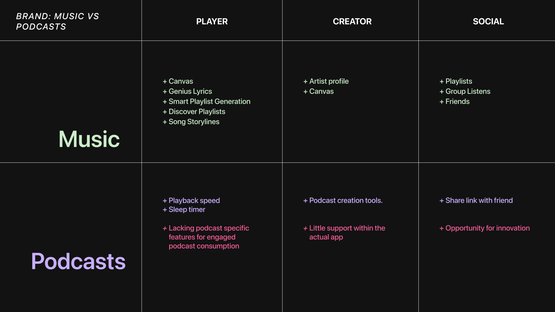
Breakdown of features Spotify has to support music listeners vs. podcast listeners.
In regards to the media player, there's a clear gap for podcast specific features, when compared to Spotify music. For creators, all of Spotify's tools for creating podcasts exist outside of Spotify's platform. However, from a social perspective, there is an opportunity for Spotify to provide a unique opportunity for sharing podcasts.
User Research + Target Audience
We begun our initial research by looking at the end-to-end journey of a podcast and how Spotify and other stakeholders fit into that journey. We identified 6 stakeholders and studied how they were all connected and impacted by each other. We focused deeper on the podcast consumer.
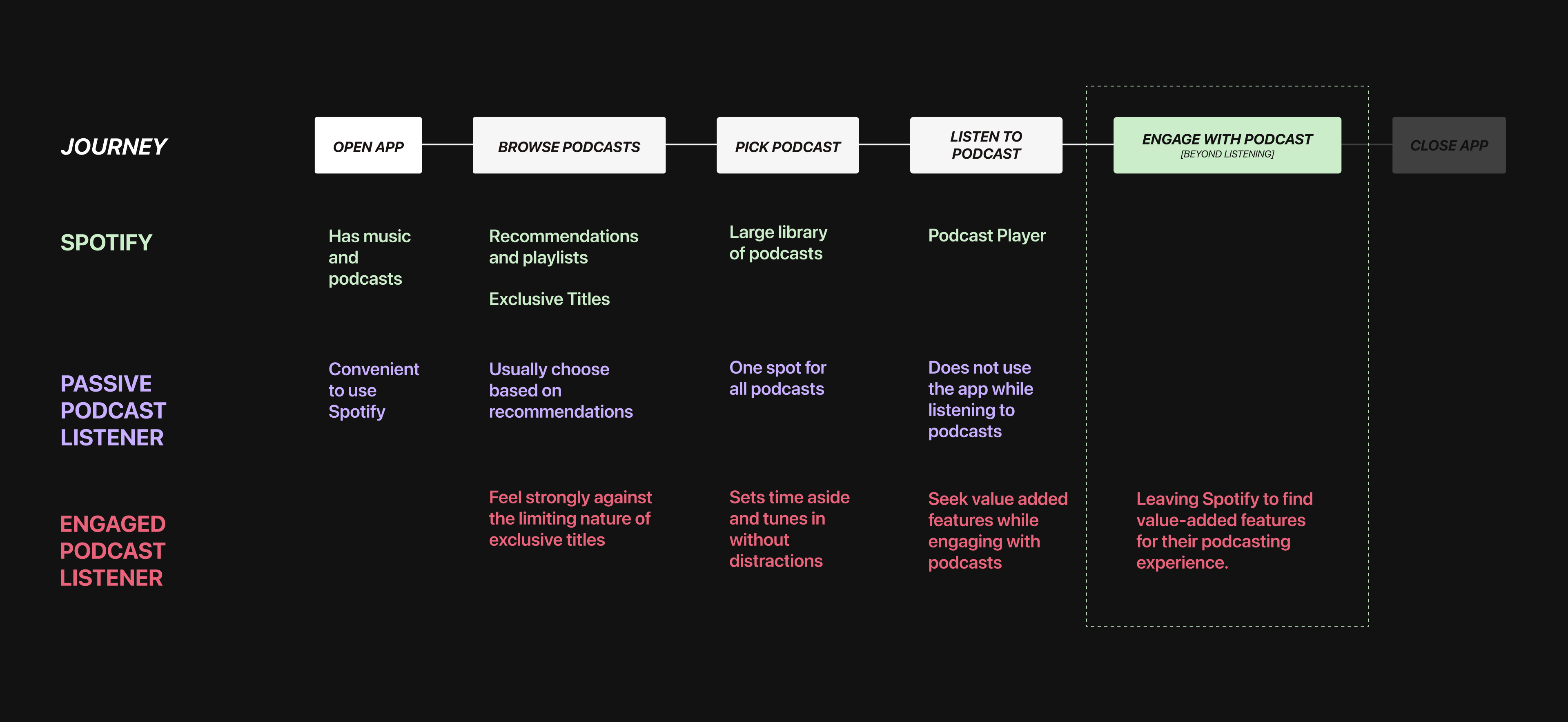
The journey map shows a comparison of the passive and engaged podcast listener.
Using a simplified customer journey map , we identfied two listener groups — the passive and engaged listeners, and their podcast experience on Spotify. Passive listeners find it convenient to use Spotify as the platform already has all their music. While listening, they don't interact with the player as they are often multitasking.
On the other hand, engaged podcast listeners feel strongly about the podcasts that they listen to, and dislike the limiting nature of exclusive titles. Often setting time aside to listen to podcasts, they also seek extra features to derive value from a podcast's content. Spotify currently does not provide listeners with the opportunity to engage with the podcasts, something that engaged users greatly desire. This opportunity helped frame our experience design intervention.
The Podcast Consumer
Through primary and secondary research, we discovered more about the motivations and pain points of a podcast consumer. For our initial primary research, we conducted a survey consisting of 77 respondents aging from 18-34 years old.
Within this specific group, most turned to word of mouth and social media for discovering podcasts, as they we unable to find good recommendations inside the Spotify app. Additionally, the same relatively basic music listening interface
cannot be implemented to podcasts for an enjoyable for experience. We asked ourselves, How can Spotify offer an engaging podcast experience that extends beyond the end of each episode?
Framing
By identifying the disconnect between Spotify’s music and podcast player, we framed our experience design intervention around the following question:
How might we enhance the experience of engaged podcast listeners through Spotify’s audio player, in order to establish Spotify as the premiere podcast platform?
Our insights pointed us to three different opportunity spaces:
- Reduce the cognitive overhead of selecting a podcast (provide tangible value related to ease of use)
- Foster curiosity and excitement for discourse surrounding podcasts (intangible value)
- Create an intimate and safe space for podcast groups (aspirational value of belonging and being a creative member)
Opportunities
To further ideate our proposed solutions, we conducted a 5 days-long Design Sprint with this question in mind:
Will streamlining the podcast consumer experience into the Spotify app establish Spotify as a podcast consumption destination for frequent podcast users?
Since our chosen area of opportunity focused heavily on the podcast player, our exploration became less about the discovery of podcasts, and more on the process of consuming it. From our sprint, we realized that these features had to not only affect the direct consumption experience but also include the pre and post-listening experience to support discovery and discourse. After researching and analyzing features on other platforms, each member began sketching possible features and interactions that could be incorporated into Spotify to enhance the direct consumption experience.
Podcasts are a very different format than music, resulting in a different engagement experience. From our user testing, we discovered that there was a clear divide between those who fully engaged with podcasts and those who passively listen to podcasts while doing other activities. Engaged listeners often had alternative apps or routines to take notes or share content, and it just “made sense” for those to be put into Spotify for a streamlined experience. Some of them used other podcasting apps, and these features would encourage them to make the change to using Spotify. This directly answered our sprint question and gave us the confidence to move forward with the concept.
We brainstormed interventions that aligned with Spotify’s brand while also creating a premium experience for podcast listeners. We narrowed down the following ways we could tailor Spotify’s audio plater to better suit the needs of podcast listeners in order to increase customer engagement and solidify Spotify as an audio leader.
01
User Interface Revamp
02
Transcript
03
Shownotes
04
Preview/Clips
Art Direction
One of my main roles was leading the art direction strategy for our newly implemented features. Our art direction was mainly inspired from Spotify’s existing visual identity.
Spotify’s design team operates under 3 design principles:
Relevant
Reflects both artist and listeners as individuals
Human
Communication, expression and human connection
Unified
How Spotify establishes coherence across their features and apps
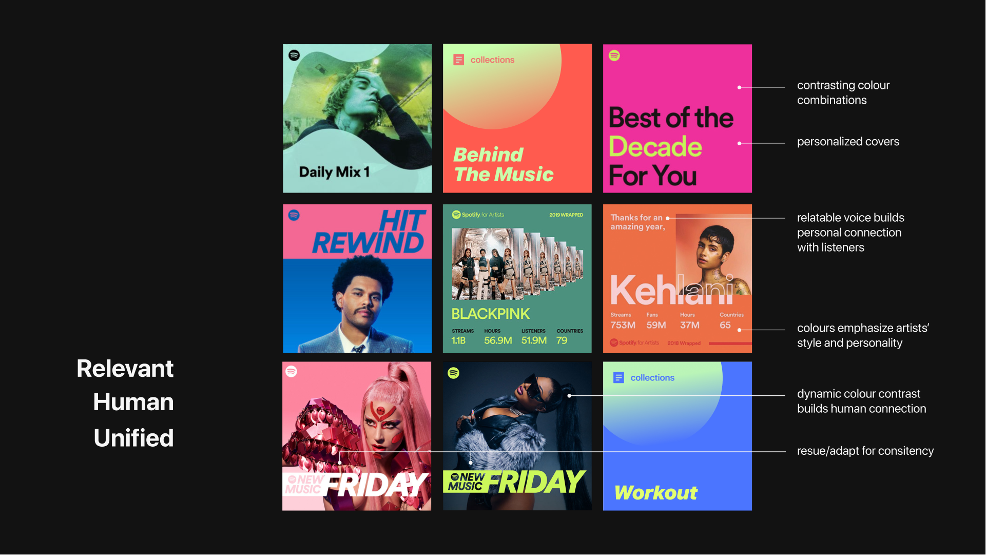
Examples of Spotify's existing art direction and our team's cover artwork.
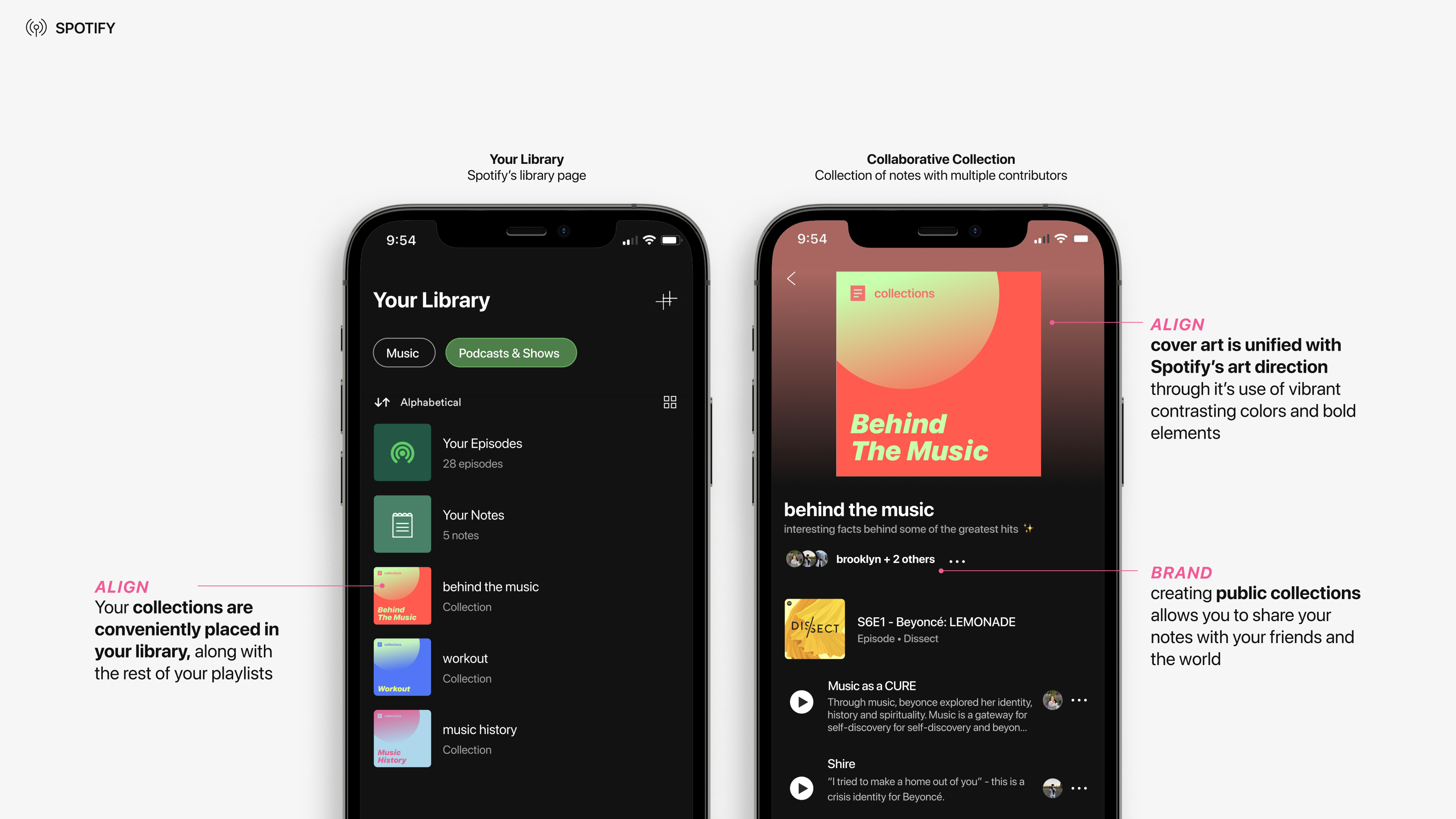
These qualities can be seen through contrasting colour combinations, the relatable brand voice that builds a connection with listeners, as well as the personalized Collections covers. When designing the Collections covers, we kept in mind similar shapes and colour elements of Spotify’s existing playlist covers to make sure our designs were unified.
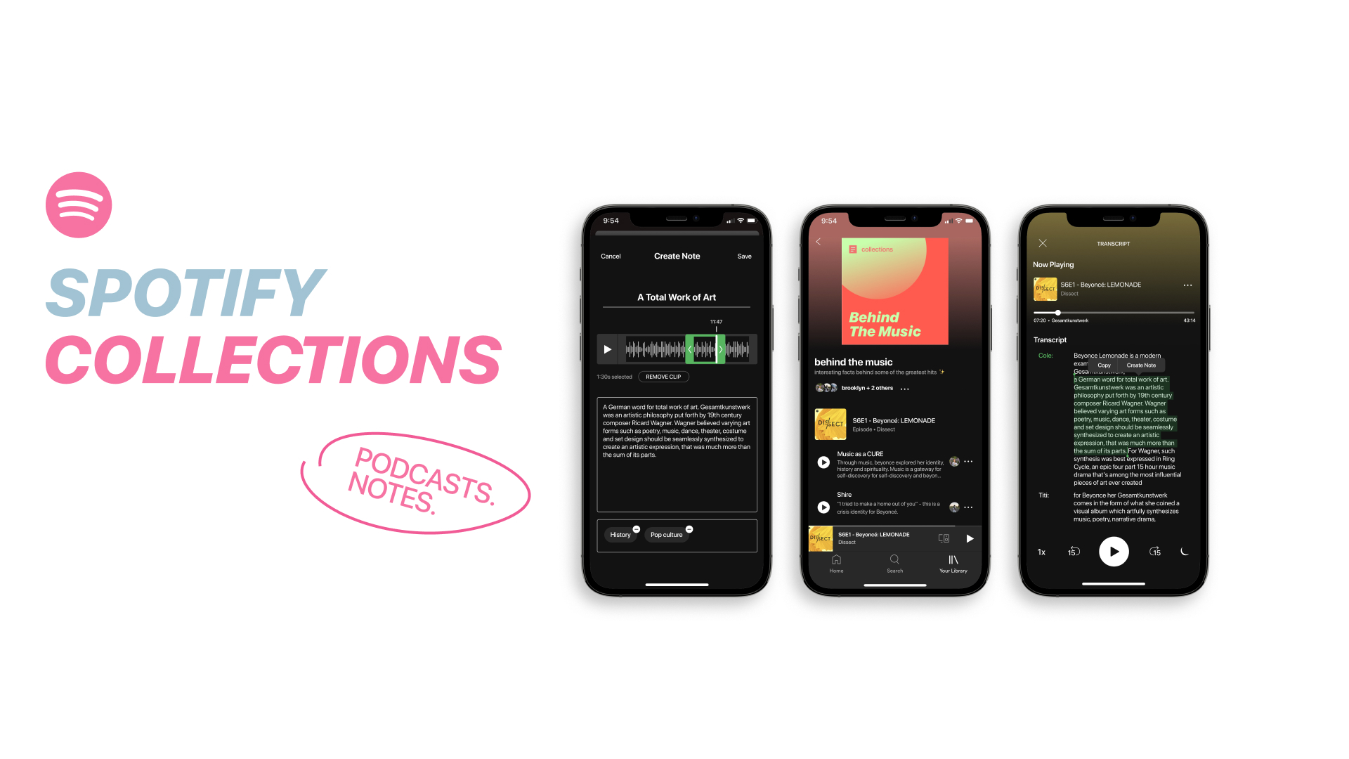
Spotify Collections is a note taking and sharing solution for engaged podcast listeners. This solution aims to:
- Provide additional value to listeners by giving them the features they need on one platform
- Reduce cognitive overhead by streamlining the listening process through new interactions
- Help align Spotify podcast to the brand values presented in the rest of the platform
Notes
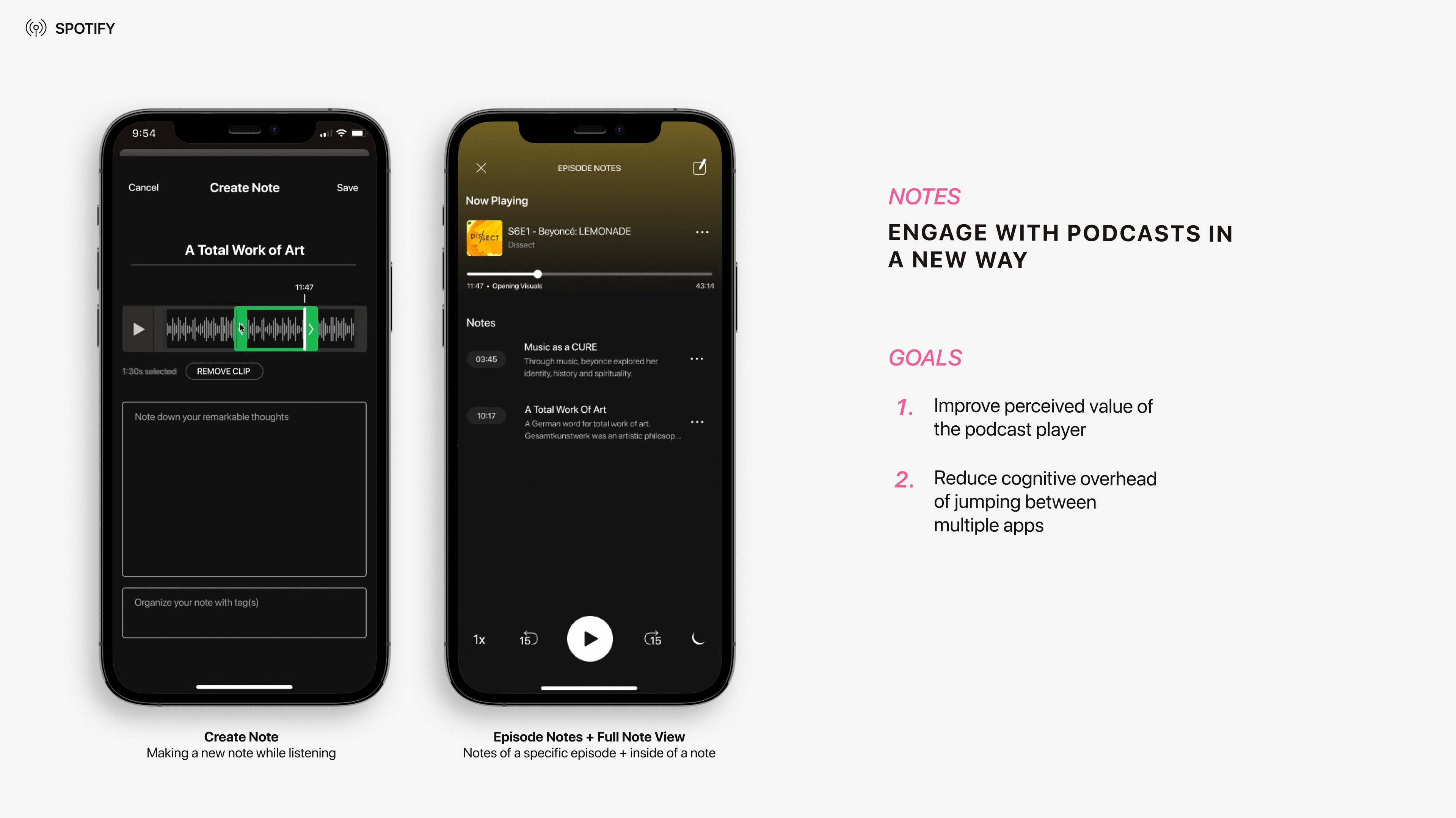
Notes, helps listeners engage with audio in a new way by providing them the tools to bookmark, save, or share clips while consuming podcasts. The goal of notes is to enhance the perceived value of Spotify's podcasts, and reduce the cognitive overhead of using multiple apps for related tasks.
Notes allows for the convenience of the engaged listener.
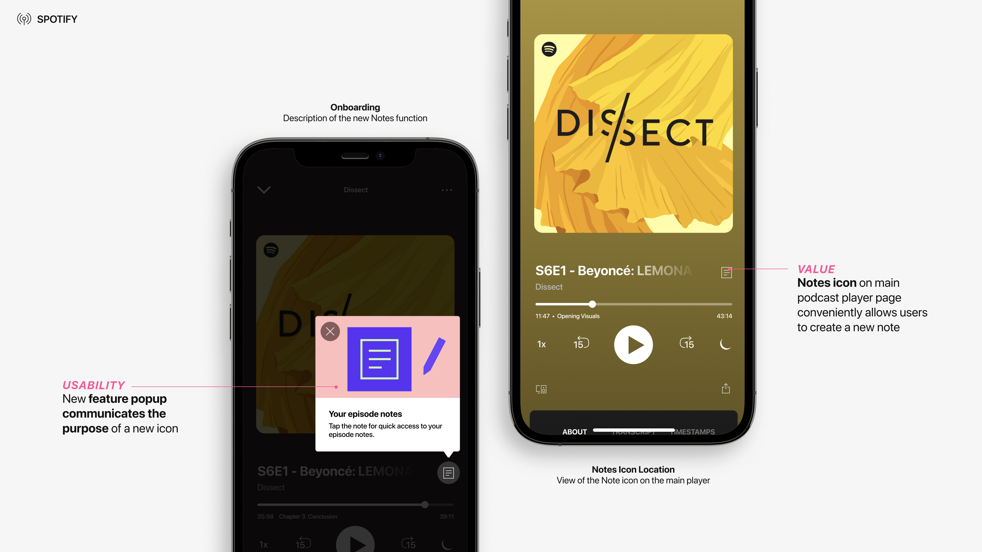
To ease and streamline the process of users familiarizing themselves with the notes icon, an onboarding popup appears when the listener opens a podcast for the first time.
The ‘Your Notes’ screen displays a group of your notes that have not been sorted into a collection will be visible. To filter through the notes, tags can assist with narrowing down the user’s search into specific categories. When a specific podcast episode is selected, users will find the ‘episode notes’ page. Here, timestamps of the episode’s notes facilitate easy access to the clipped sections of the podcast.
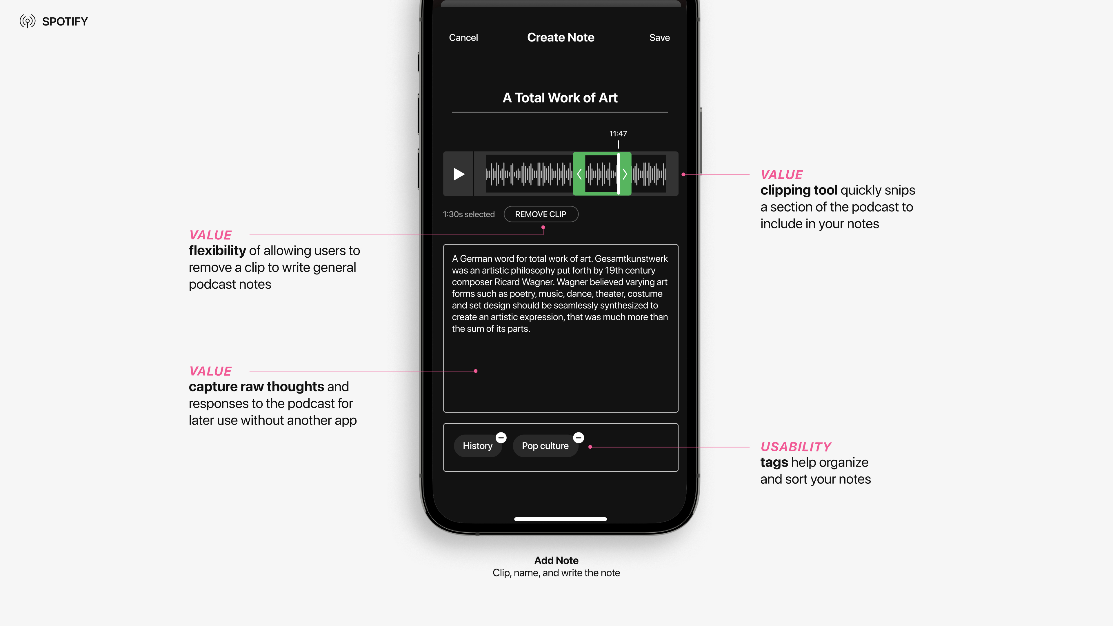
The audio clipping tool allows users to quickly snip a section of the podcast to include in their notes. Listeners can also exclude creating a clip to make general notes as they have the option to note accompanying thoughts. Additionally, adding a tag helps with identification and organization of notes.
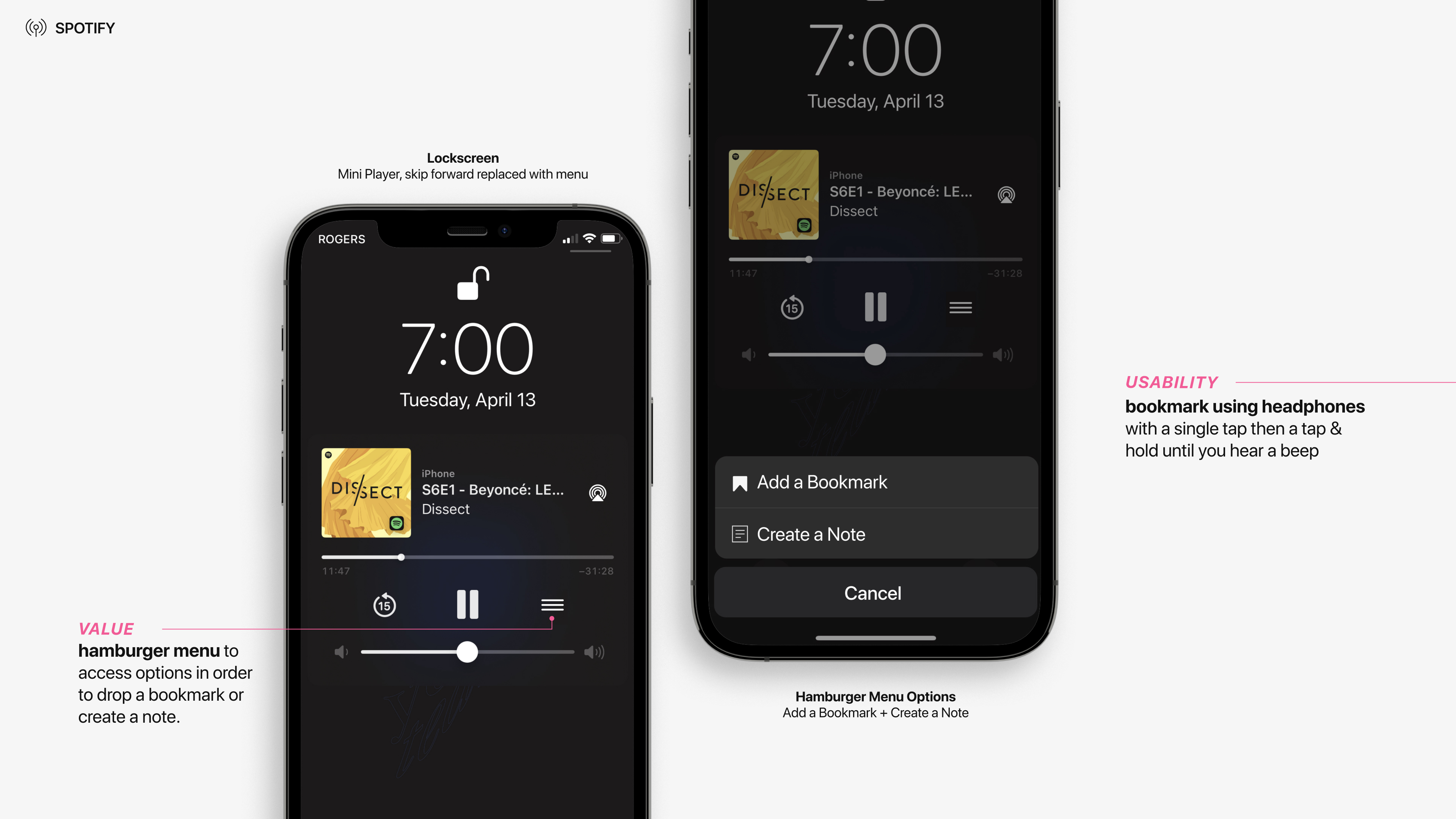
When listeners find themselves consuming a podcast with their phone locked, our addition to the lock screen mini player allows listeners to instantly add a bookmark for later use, or select create a note to be directed into the app. Listeners can also add a bookmark with their headphones by performing a short press, followed by a press and hold until they hear a beep.
Collections
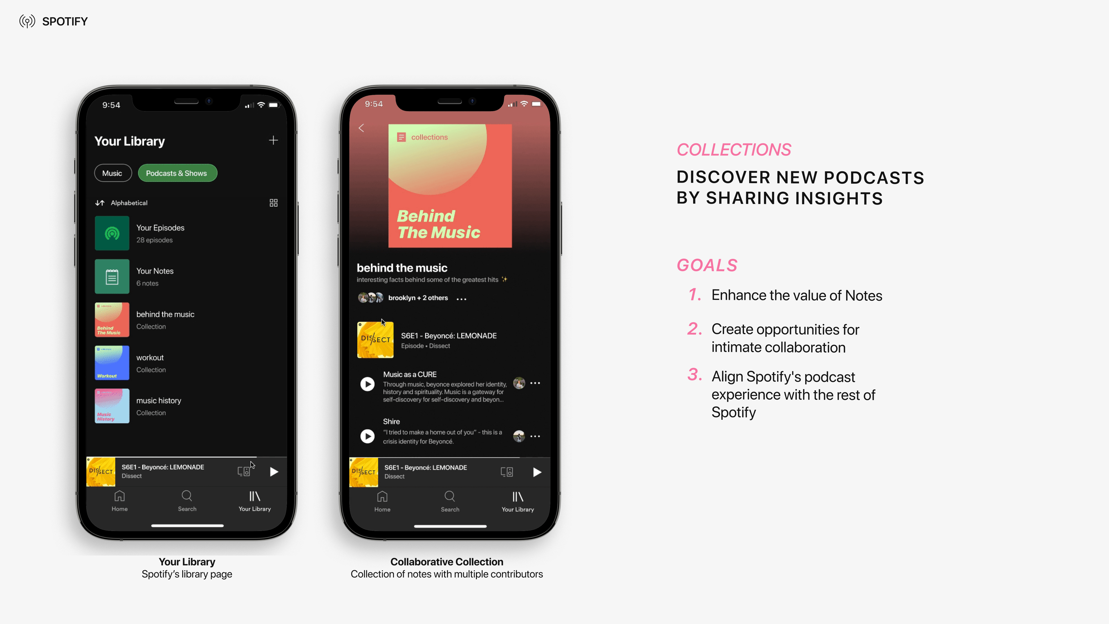
Collections are playlists of notes that can be private, collaborative, or public. This feature uses Spotify's existing treatment of their social aspects: intimate and collaborative. Collections aims to enhance the value of notes by creating opportunities for intimate collaboration and aligning Spotify's podcast experience with the rest of Spotify.
Collections encourgages collaboration and discovery.
Collections can be accessed from within your library, where the rest of your playlists exist. The automatically generated cover art is unified with Spotify's art direction through it's simple bold elements and vibrant contrasting colours. Listeners also have the choice to publicly publish their collections, share them with friends, or the world.
Information Cards
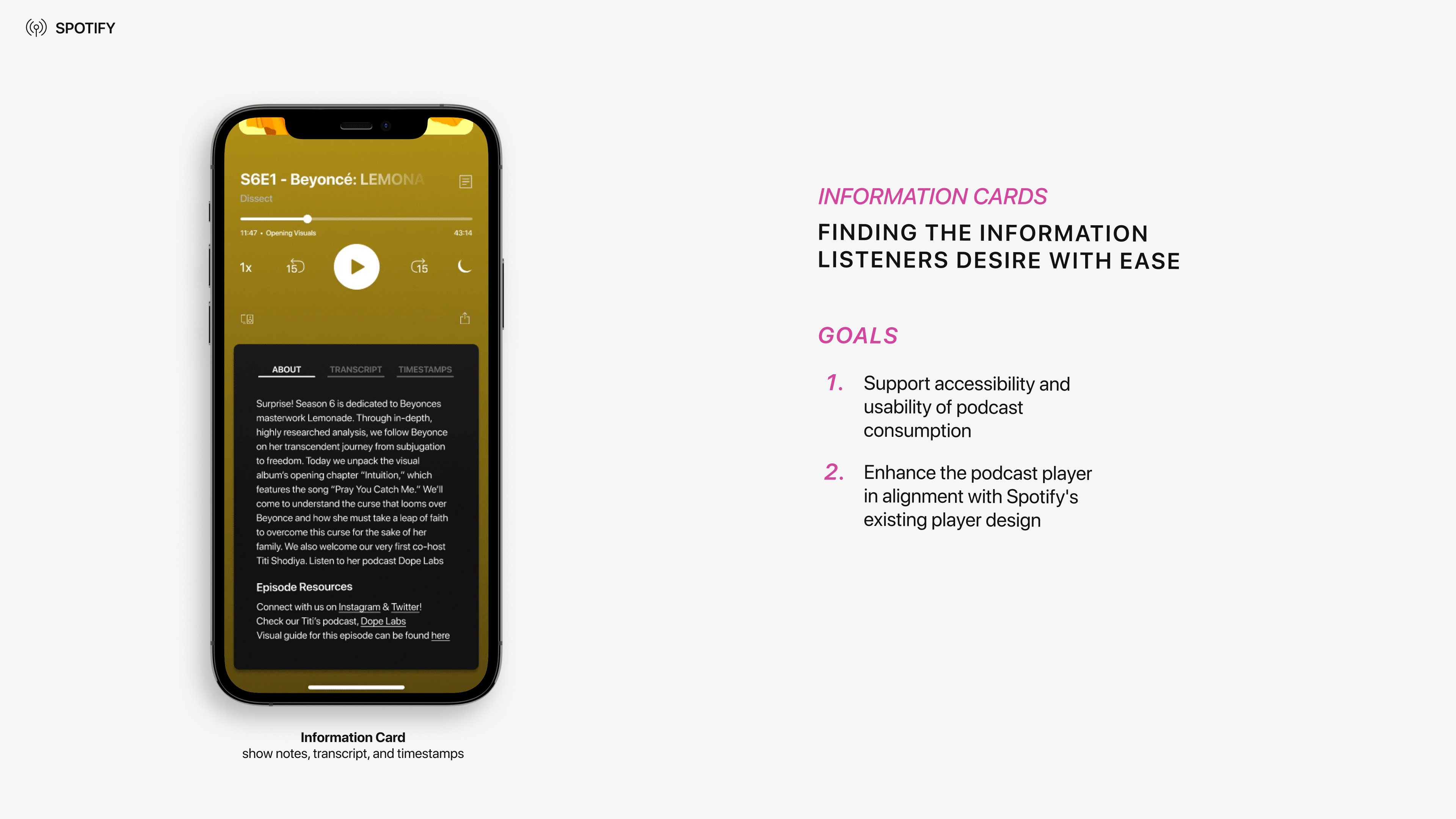
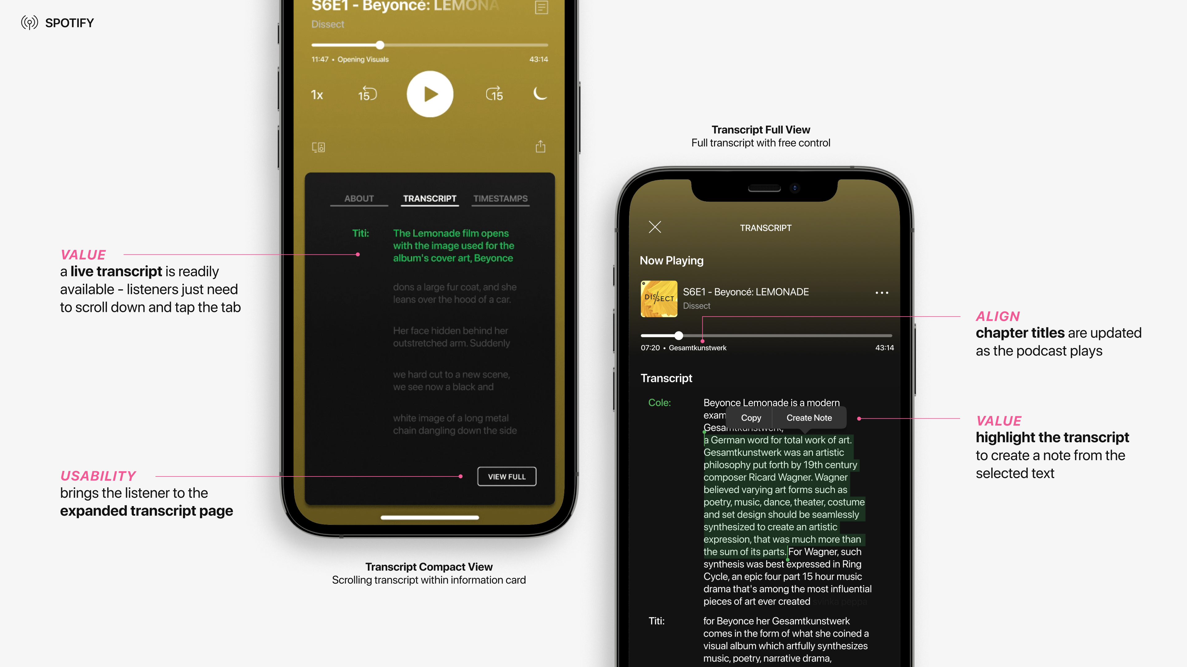
Information Cards, was introduced to help listeners connect with podcast content in alternative ways by enhancing the podcast player in alignment with Spotify's existing player interface. By making episode details accessible and creating a space for creators to include the transcripts and timestamps of their show, listeners will have the tools they need to effectively consume podcasts.
Information cards focuses on accesibility for the engaged listener.
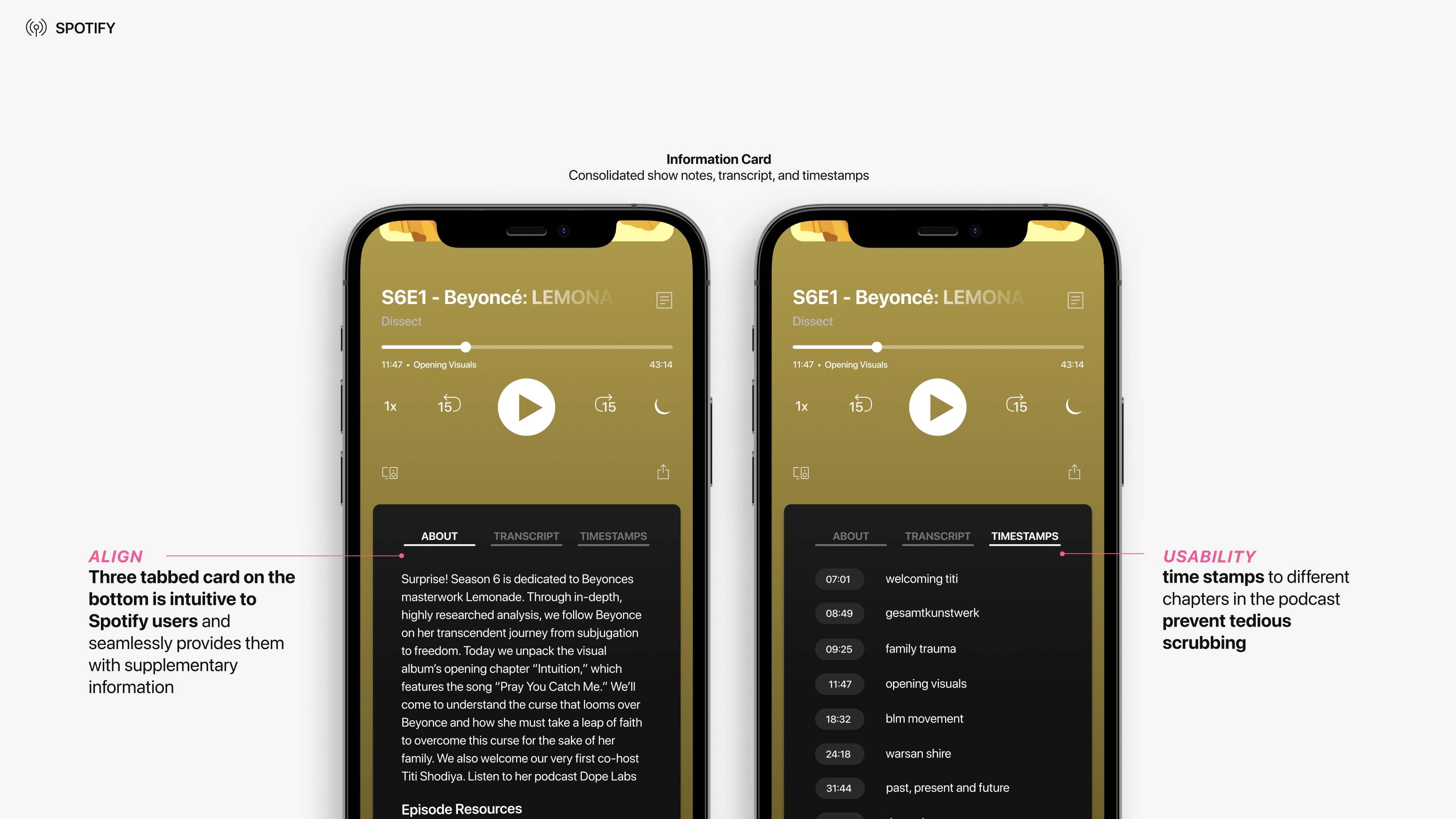
The three tabbed card on the bottom is intuitive for Spotify users and provide them with supplementary information without having to navigate to a different page. With a quick tap, users can explore the episode resources to connect with the podcast or check out time stamps to get an outline of the podcast topics
A live transcript is also available on the cards, providing accessibility and captions for those who need them. Expanding to the full view includes the current chapter of the podcast and is for additional guidance. From this screen, listeners can hold down on interesting sections to create a note if they desire.
For Users
We confirmed that the value of Spotify Collections for the engaged listener through our user testing. The users described that the tools would add value to their overall experience. Some users using other podcast applications expressed that the features proposed could potentially cause them to switch over to Spotify from their current applications.
For Spotify
Through Collections, Spotify’s brand perception also grows from just a music platform to a music and podcast platform due to their ability to facilitate the podcast consumption journey beyond just listening. Engaged Listeners also transition to Spotify due to the more holistic experience, increasing ad revenue and potentially premium subscriptions.
Reflection
After 6 weeks of countless iterations and challenges, I am proud of my team and I’s effort in producing a design intervention for Spotify podcasts that balanced all aspects of design. As one of the main UI and graphic designers, it was crucial for me to adapt to Spotify’s brand to create a solution that aligned with their values. This project allowed me to grow as a designer as I was able to learn how the business and design aspects of a brand intersect with one another to form a unified experience for podcast users. I have gathered many valuable insights through brand researching, art direction, and user testing which has allowed me to grow as a design student. Overall, I really enjoyed working on a client that I personally appreciate and designing a prototype that could potentially be built in within Spotify’s platform.
