A Court of Thorns and Roses
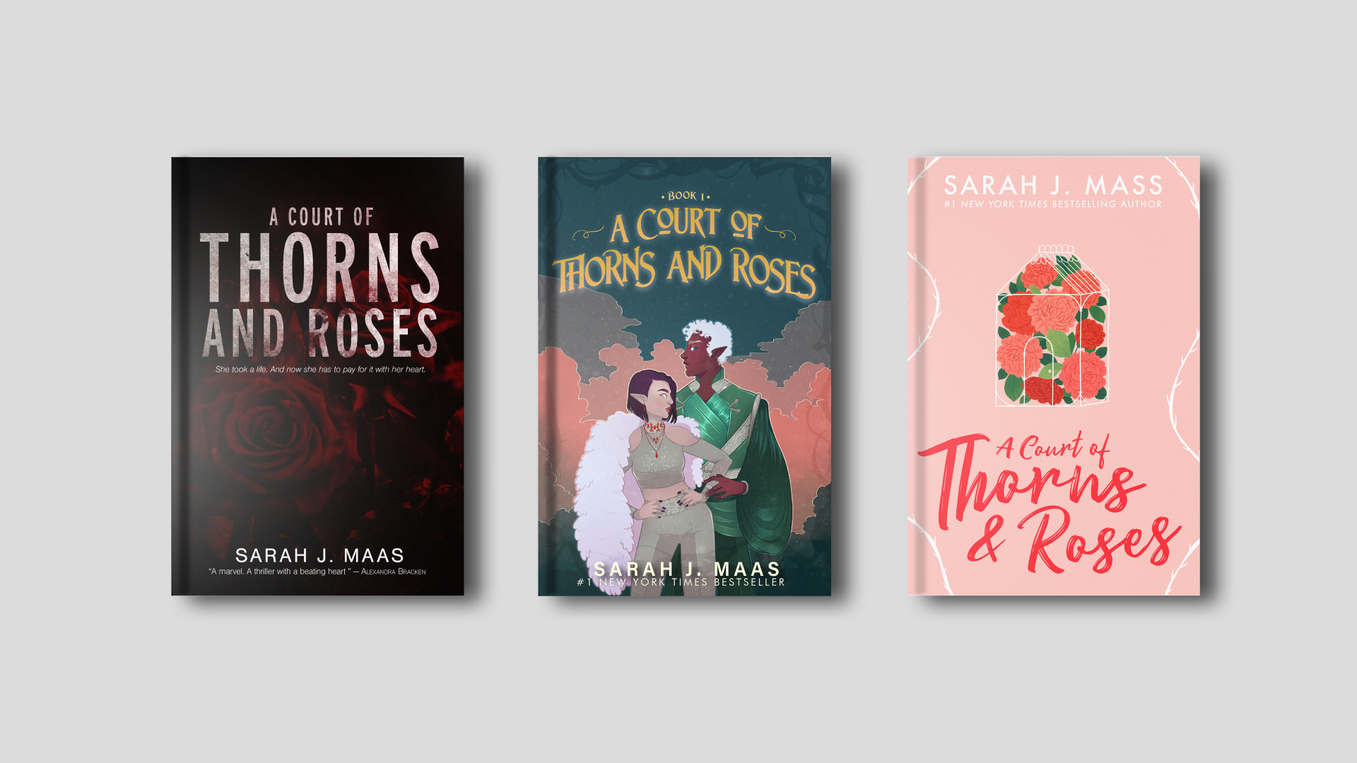
A redesign of the #1 New York Times Bestseller A Court of Thorns and Roses by Sarah J. Maas.
Duration
3 weeks
Roles
Brand Identity, Print Design
Tools
Figma, Adobe Illustrator, Adobe Indesign, Adobe Photoshop
The task was to redesign the cover of an existing book for three different audiences, each representing a distinct genre. The project focused on developing cover concepts and typographic formats that clearly convey the genre and appeal to the intended audience, while exploring the design requirements for different book genres.
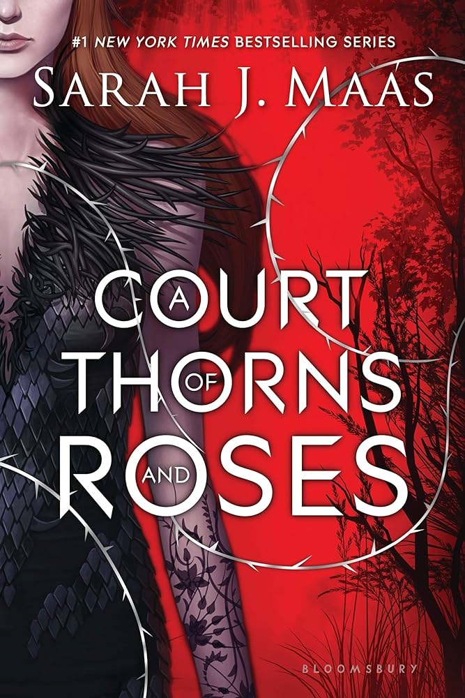
The book that I chose for this project was A Court of Thorns and Roses by Sarah J. Maas. This fantasy novel follows the journey of a mortal huntress, Feyre Archeon, who is kidnapped by a beast named Tamlin as punishment for murdering a faerie. She is taken back to his faerie land, Prythian, where she is forced to live at his estate. As she lives in Prythian, she discovers the dangerous truth of the faerie lands while developing her feelings from hate to love for Tamlin. Feyre takes on a fight to break an ancient curse to save Prythian. The audience is targeted towards readers who enjoys fantasy settings, adventure, romance, action and a coming of age story of the heroine. This book is categorized under young adult fantasy.
The audience of mystery thriller are young adult/ adult readers. They are compeled in the intense setting of suspense and the thrilling action in solving a mystery.
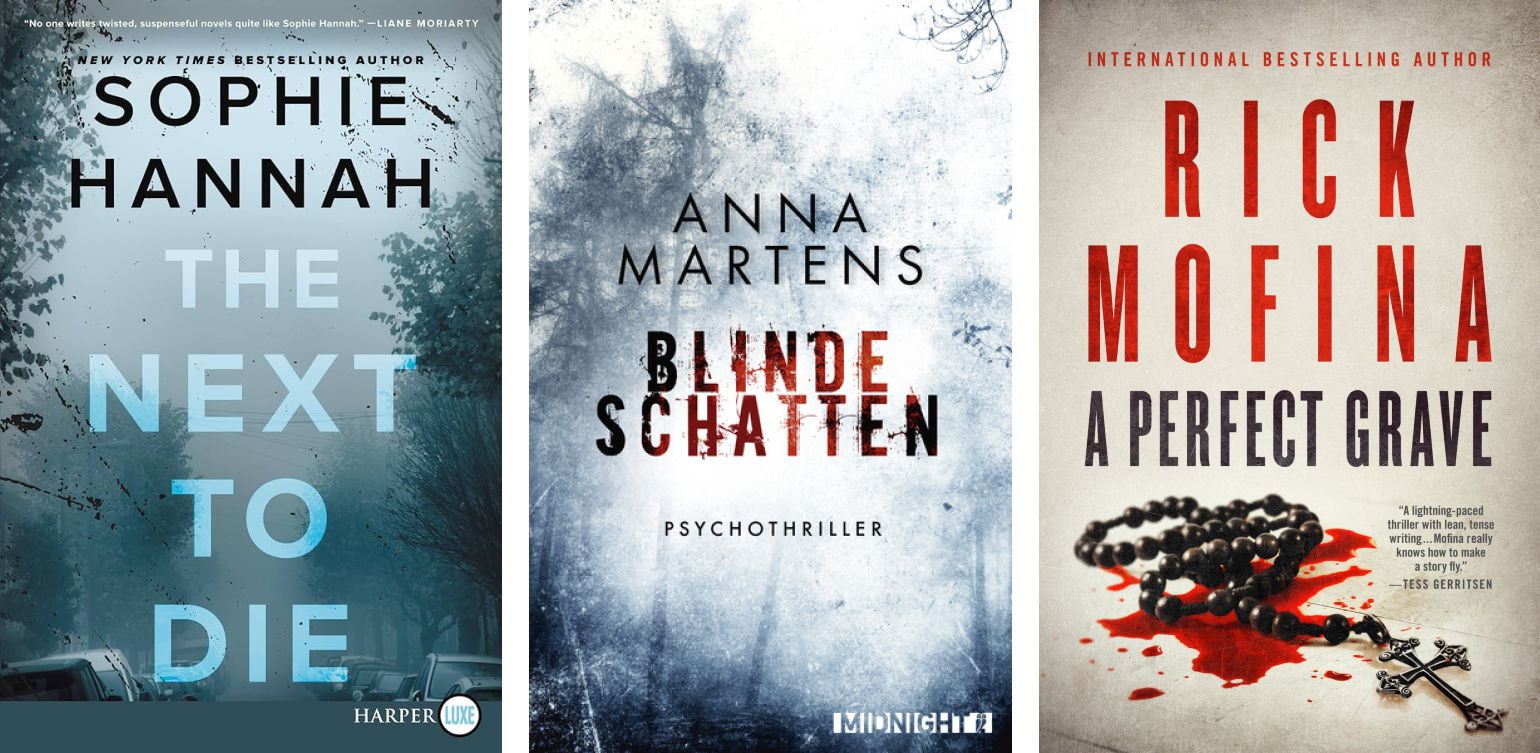
Examples of mystery/thriller book covers.
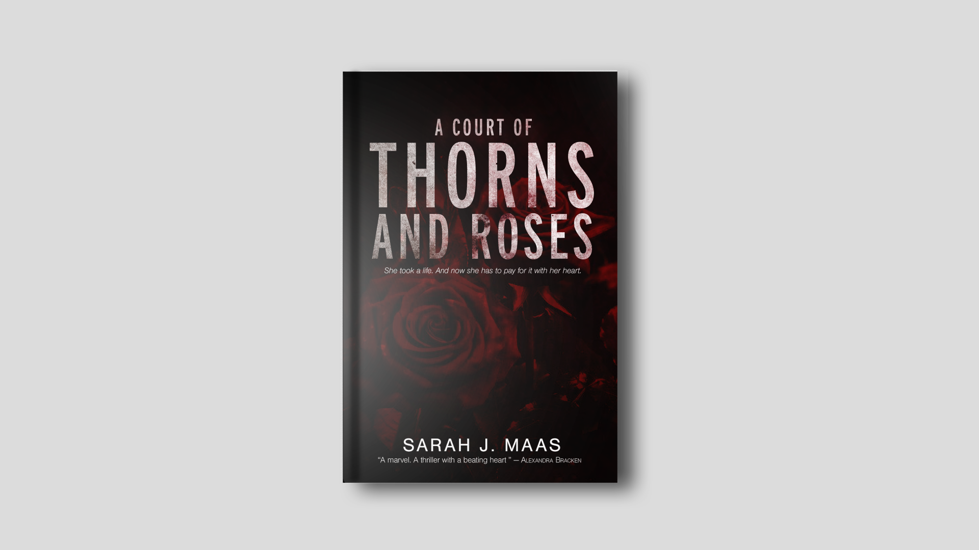
Final Concept of A Court and Thorns and Roses as a mystery/thriller novel.
For the mystery/thriller book cover, I selected Interstate Condensed Bold for the title to create a strong, geometric presence, contrasting it with the wider Nimbus Sans for the subtexts. To evoke a sense of suspense and emptiness, I increased the letter spacing of the title, which contrasts with the boldness of the typeface, creating a feeling of void. An overlay of texture adds noise, further enhancing the sense of anxiety.
The color palette is deliberately dark and minimal, using only red, white, and black to focus attention on the cover's main elements. The black background amplifies the boldness of the title, while red serves as a powerful accent, symbolizing both life and death. The abstract, enlarged rose, paired with the tagline, deepens the sense of mystery and suspense, leaving readers intrigued by the ominous tone of the story.
The audience for this genre reflects young readers who love the magical adventure and imagination of supernatural worlds. The demographic of young readers fall between ages 9-12 year’s old.
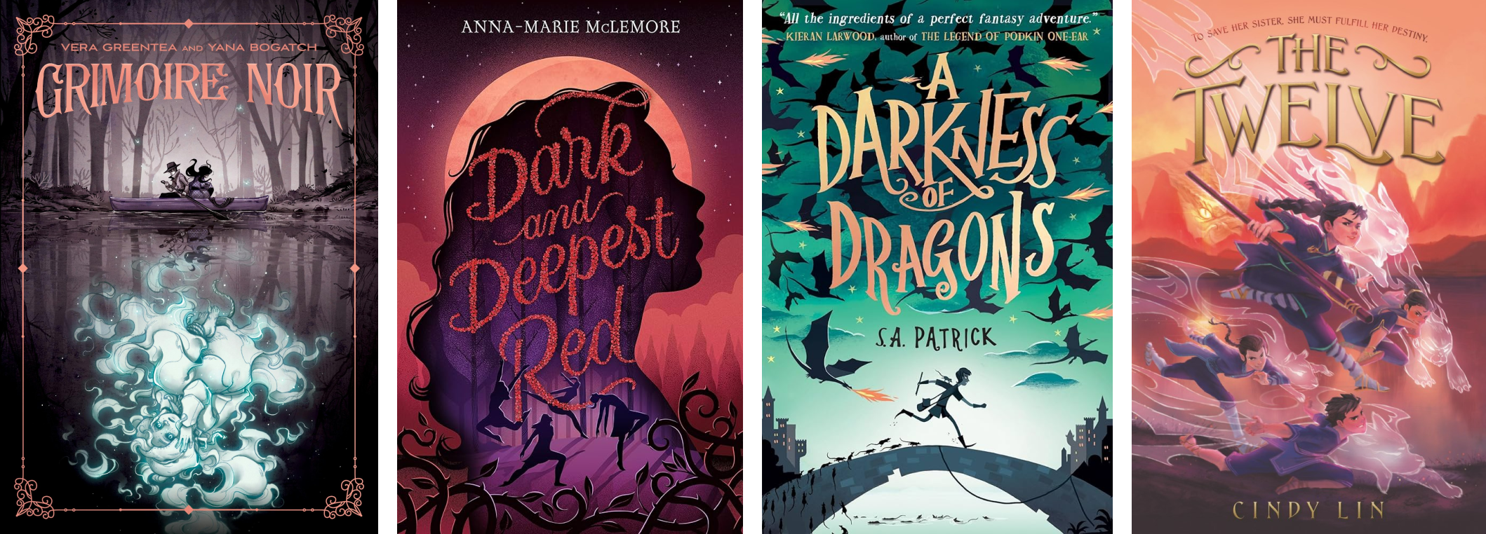
Examples of children's fantasy book covers.
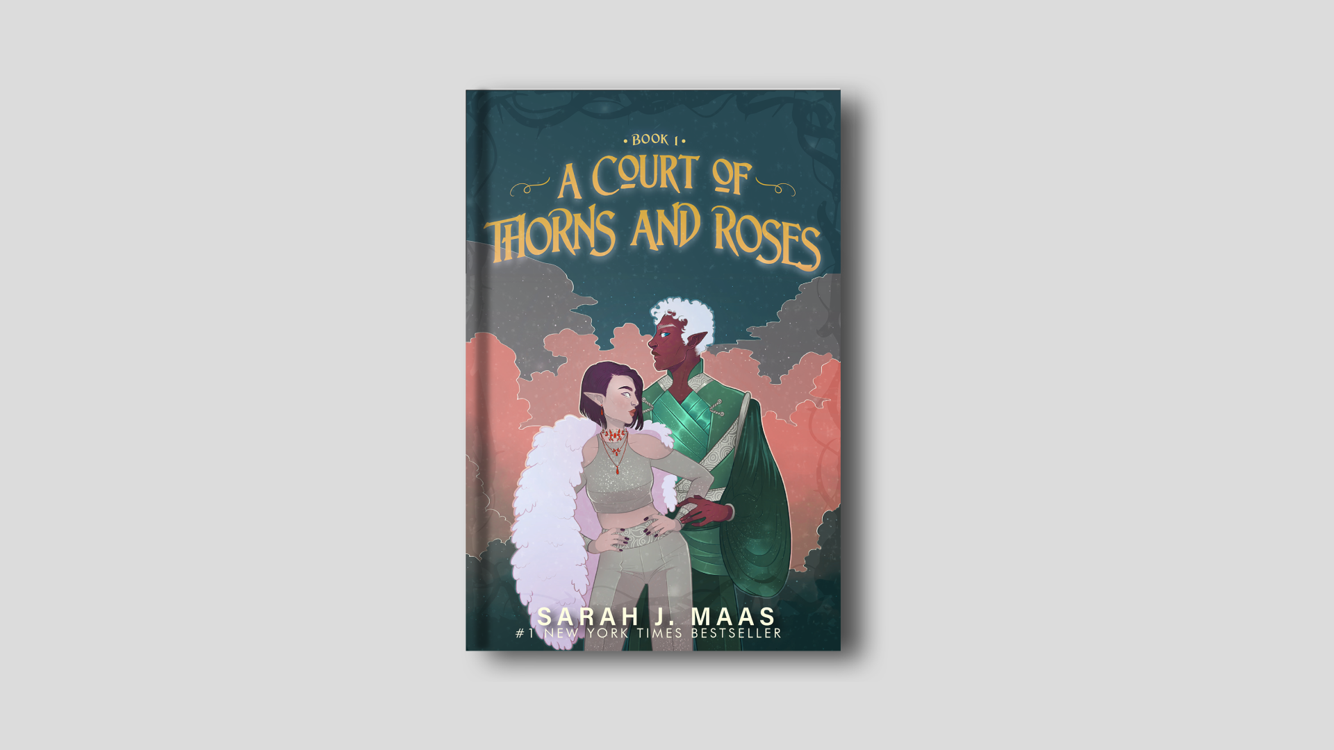
Final concept of A Court and Thorns and Roses as a children's fantasy novel.
For the children’s fantasy novel cover, I used the Lightfoot typeface, applying a gold, shiny treatment to evoke elegance and heroism typical of the genre. The decorative font, paired with embellishments, reinforces the court-like, royal tone of the story. Unlike the other covers, this one takes a literal approach, illustrating the two main characters to give readers a clear sense of the fantasy world. The dark blue palette contrasts with warm tones, drawing attention to the characters. The animated style appeals to a younger audience, allowing them to imagine their own interpretation of the story. Thorns subtly frame the characters, symbolizing the novel’s complex and twisted events, while glowing textures highlight the whimsical, magical nature of the fantasy setting.
Contemporary Romance depicts love stories generally set in present world time. The audience of this genre reflects teens and young adults who enjoy romanticizing and dreaming of love.
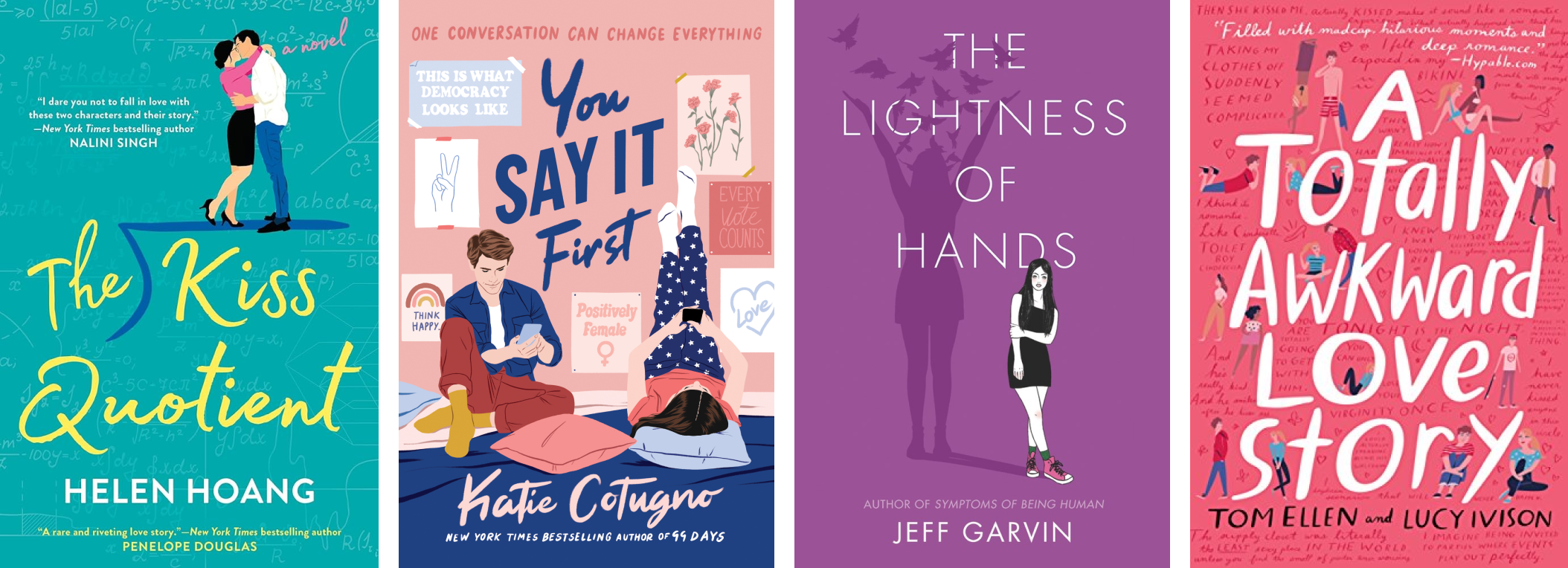
Examples of contemporary romance book covers.
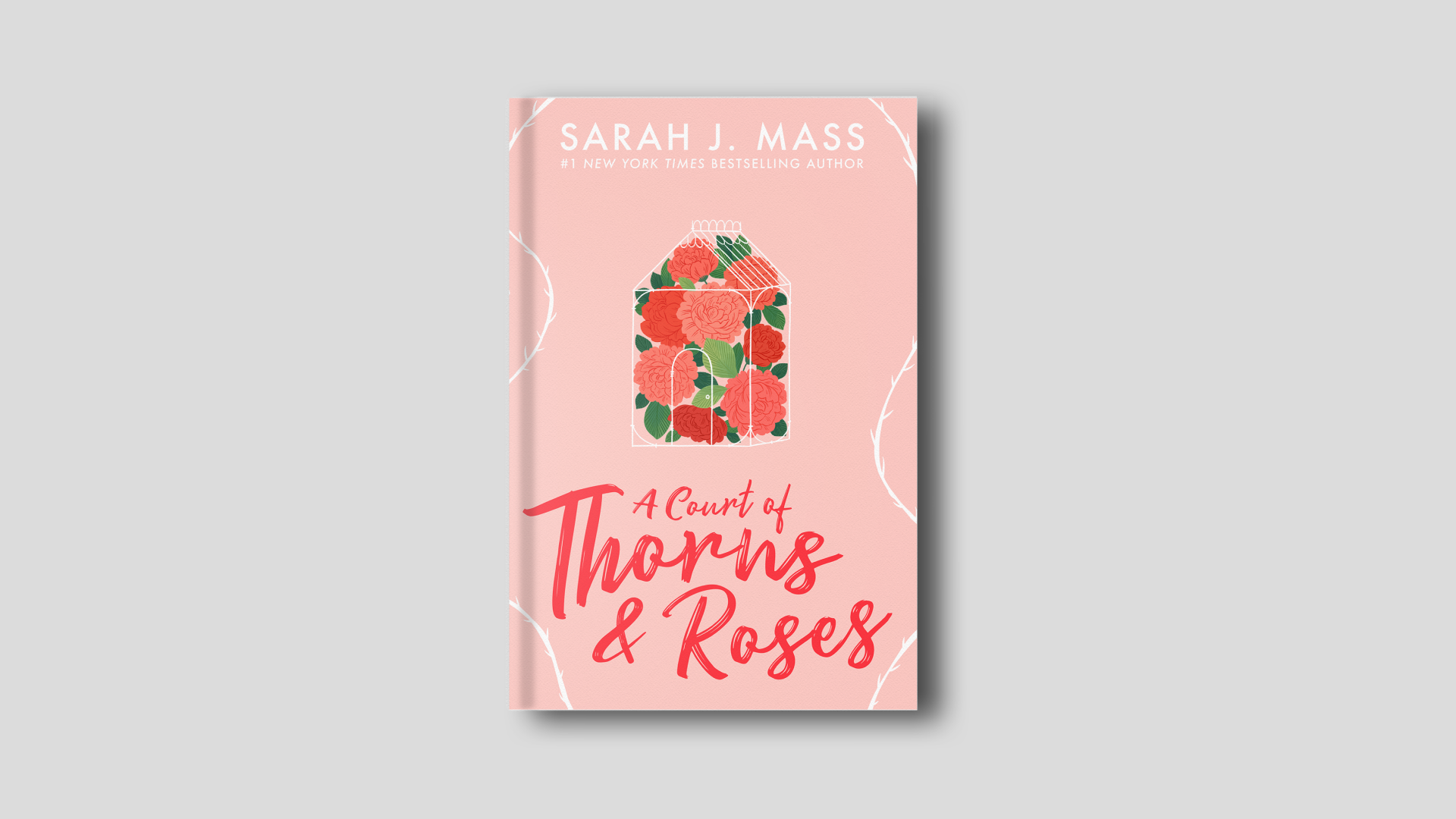
Final concept of A Court of Thorns and Roses as a contemporary romance nove
For the Contemporary Romance Fiction, I utilized the script typeface Red Bright Regular to reflect a more romantic and elegant style. I explored using contrasting type sizes for the title to create a more organic and softer shape to its composition. In contrast, I paired it with a sans-serif type, Futura for the author name and tagline. The juxtaposition between the two typefaces help to emphasize the book title while also reflecting the modern minimalistic style of young adult, contemporary romance covers. A flat illustration of roses caged within the house wireframe acts as a symbol of Feyre and Tamlin’s love being captivated and repressed by the events that happen. The simple illustration also emphasizes the minimal tone of the overall cover. Additionally, I incorporated the thorns around the border of the cover to frame and draw the readers attention toward image. I intended to use thinner and delicate strokes in order to not distract the reader’s eyes from the rest of the cover components. I chose to present a softer, pastel colour palette to reflect the essence of love within the romance novel. A lighter pink was used to contrast with the vibrant pinks of the illustration and title.